This Old FX Shop: Realistic Hand Wound
In this revisit of a favorite practical effect, Frank shows us how to build up and paint a realistic hand wound for Halloween or your next horror film, using a kit from Smooth-On.
12 thoughts on “This Old FX Shop: Realistic Hand Wound”
Leave a Reply
One Day Builds
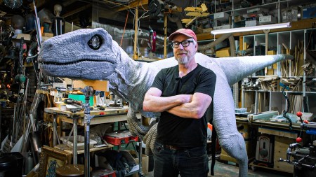
Adam Savage’s One Day Builds: Life-Size Velocirapt…
Adam embarks on one of his most ambitious builds yet: fulfil…

Show And Tell
Adam Savage’s King George Costume!
Adam recently completed a build of the royal St. Edwards cro…
All Eyes On Perserverance – This is Only a Test 58…
We get excited for the Perserverance rover Mars landing happening later today in this week's episode. Jeremy finally watches In and Of Itself, we get hyped for The Last of Us casting, and try to deciper the new Chevy Bolt announcements. Plus, Kishore gets a Pelaton and we wrack our brains around reverse engineering the source code to GTA …
Making
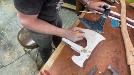
Adam Savage in Real Time: God of War Leviathan Axe…
Viewers often ask to see Adam working in real-time, so this …

One Day Builds
Mandalorian Blaster Prop Replica Kit Assembly!
Adam and Norm assemble a beautifully machined replica prop k…
House of MCU – This is Only a Test 586 – 2/11/21
The gang gets together to recap their favorite bits from this past weekend's Superb Owl, including the new camera tech used for the broadcast and the best chicken wing recipes. Kishore shares tips for streamlining your streaming services, and Will guests this week to dive into the mind-bending implications of the latest WandaVision episod…

One Day Builds
Adam Savage’s One Day Builds: Royal Crown of Engla…
One of the ways Adam has been getting through lockdown has b…
Making
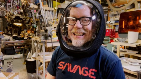
Adam Savage Tests the AIR Active Filtration Helmet…
Adam unboxes and performs a quick test of this novel new hel…
Making
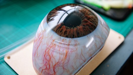
Weta Workshop’s 3D-Printed Giant Eyeballs!
When Adam visited Weta Workshop early last year, he stopped …
One Day Builds
Adam Savage’s One Day Builds: Wire Storage Solutio…
Adam tackles a shop shelf build that he's been putting off f…









Ok, guys so now I have to try that. Thanks for the video. -dano
Cool! Got to get this stuff shipped to Belgium! 🙂
Just wondering Frank: would it be possible with this technique to create such a depth in a wound that you could simulate seeing an artery (like in the wrist)? Or would a different technique be better?
Awesome video guys, keep it up. Thanks!
That was very cool, very informative. Nicely done, guys.
Awesome to see an AvE shirt.
Amazing. Norm’s wound looks like an animal bite.
Have a question for Frank. How is hair applied to the wound? Your wound looked slightly shaved compared to the rest of your hand.
Nice! I was talking to a rep from the company about this at C2E2 in Chicago the other weekend.
regarding what frank said about colour, having to learn to observe:
i’d add to that the need to learn to see colour in a systematic way, so that you can look at a colour and ‘place’ it in the spectrum, and know what the difference is to where you want it to go.
a good start is looking at the colour pickers in graphics programs: whenever they have sliders for hue, saturation, and value, that’s a pretty valuable tool to get a start in dissecting a colour into its constituent properties. a hue difference is when there is a shift in what colour there is, say from a magenta-ish red to a slightly orange red. or from purple to yellow. a saturation difference is when the intensity of colour shifts, say from pale red skin to inflamed skin. or grey to flourescent yellow. a value difference is a shift in lightness, for example from brown to orange. or black to white. (in skin, shifts in value and shifts in saturation can be really tricky to get just right, because more saturation usually makes skin also look a bit darker. practise, practise, practise.)
once you got the interplay of these three properties internalised and practised, you can look into how to mix paints to do what you want – sadly, when using pigments and paint, we can’t just shift the sliders around and say ‘i want to make the hue go +5 in this direction and bump up the saturation a bit.’ we have to introduce new pigments that do the shift we want. that’s a whooole new can of worms, and always a bit dependent on the kinds of paints, but starting pointers would be: when you can imagine the ‘points’ in the spectrum for two colours, mixing them will result in something more or less along the line between them. (there’s usually some kind of tinting bias that puts mixtures off that line, but… more or less.) so you can use a perfectly neutral grey to lower the saturation of a colour, but also a pigment of its complementary hue. using white and black for lightening and darkening is crazy effective, but usually introduces a somewhat chalky look – that’s where observation and practise comes in. observation to sleuth out what hue and saturation shifts are happening alongside the big value shift you saw, and practise to know how your pigments interact with each other, and what to add in to counteract certain tendencies. (that’s also why darkening with brown is usually a safer bet – it’ll always shift hue towards a natural colour, and avoid that chalky, grey look)
on colour mixing, there’s really tons and tons to read and learn (and practise), but thinking of colour wheels with the hue going around, grey in the middle and full saturation at the outside border, is a valuable map.
nice pointers, thanks. Seeing how to mix colors has always been hard for me
Dat packaging tho!
The entire reason my eBay suggestions are full of beyblades.
Never worn anything like this before. How do you remove the piece?
EDIT:
Well, i should have waited to the very end of the video.. and not two minutes earlier haha. Thanks!
Great video. I was just asked to do some sfx makeup for a new play by a local playwright, it’s full of gore. This is a huge help. Now to start a shopping list. 😉